 |||
|||
Everyone has some complicated relationships in their life. My relationship with color is complicated. I love color but I also love it’s absence. I’m also in a minority group in how I perceive the spectrum. About 8 percent of men and 0.5 percent of women have protan color blindness. Which isn’t blindness at all, it’s just a difference in how colors in the red-green spectrum are perceived.
My parents and I first learned of this genetic trait when I was about 5 or 6. I remember my folks telling me much later that they couldn’t understand why their otherwise relatively bright son could not learn the names of certain colors. A “color blindness test” in some popular magazine of the day and a follow up trip to the optometrist confirmed the perceptual “deficiency”. Sometimes I’ll have difficulty reading a poorly designed label or determining if the blinking light on some device is red or green. Otherwise, it’s daily impact is minimal. In photography, things get a bit more interesting. The high school I attended had a large industrial arts program complete with a well-equipped darkroom. I took photography courses throughout high school and shot for the yearbook. When it came time to learn color printing I had trouble, magenta and cyan were lost on me and I would always need a classmate’s help in color grading my prints. Luckily color was expensive and 90 percent of the yearbook photographs were in black and white!
For the most part I gave up darkroom work after high school and, until digital photography and editing came along, I was content to let the local lab determine the color grading of my prints. With digital I now enjoy the process of editing as much as the process of photographing. Two complimentary sides of the creative process.
I used to be self-conscious about sharing color work. What if my colors are all wonky? I finally made peace with the fact that it doesn’t really matter. All art is subjective anyway and perception is multi-faceted and intimately personal. I process photos, color and and black and white, to suit my tastes and what I think works for the subject.
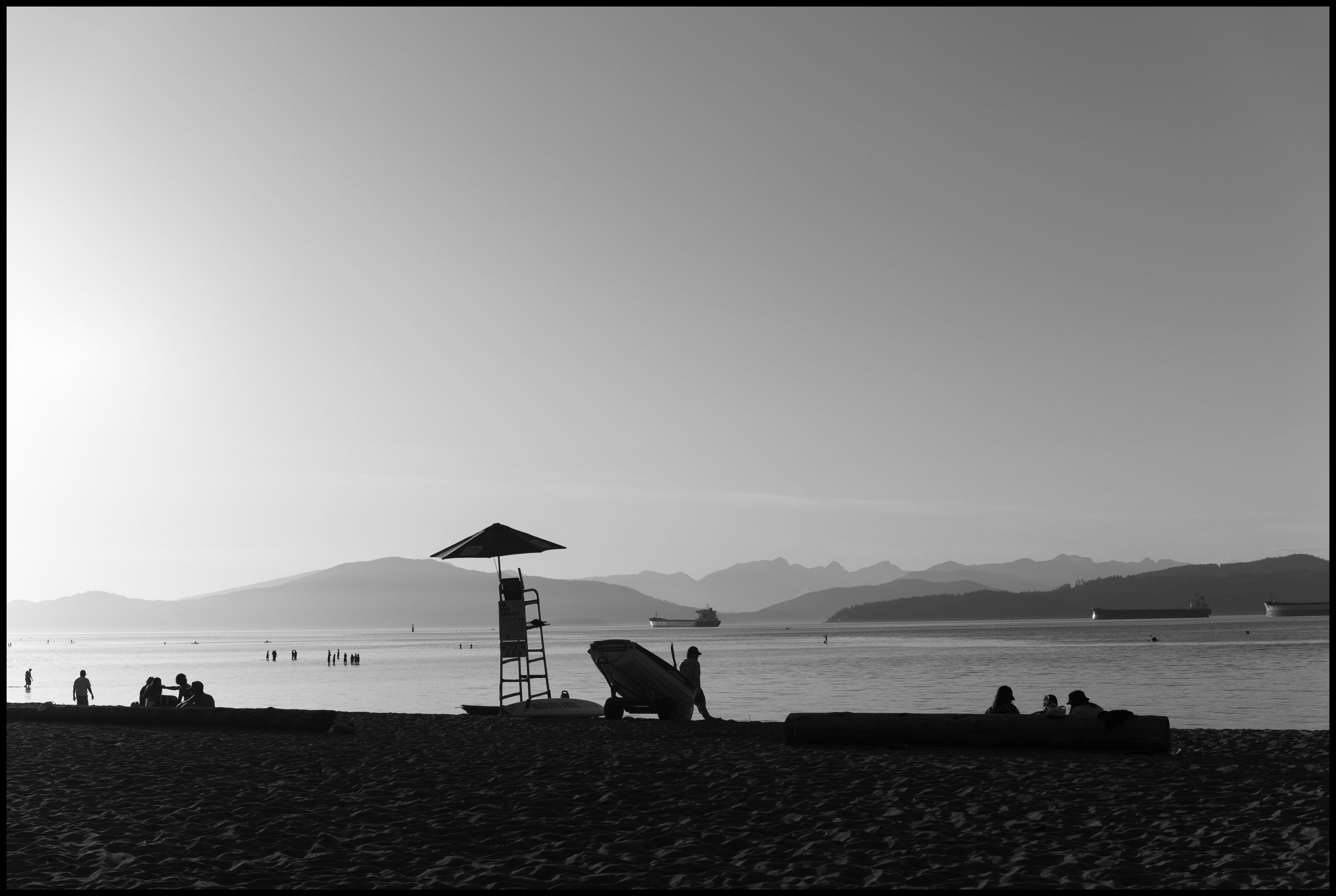
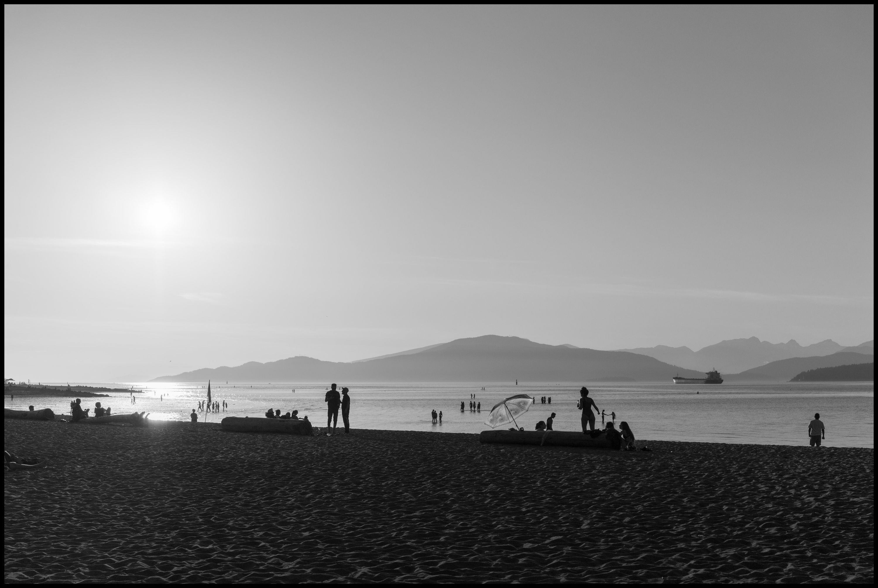
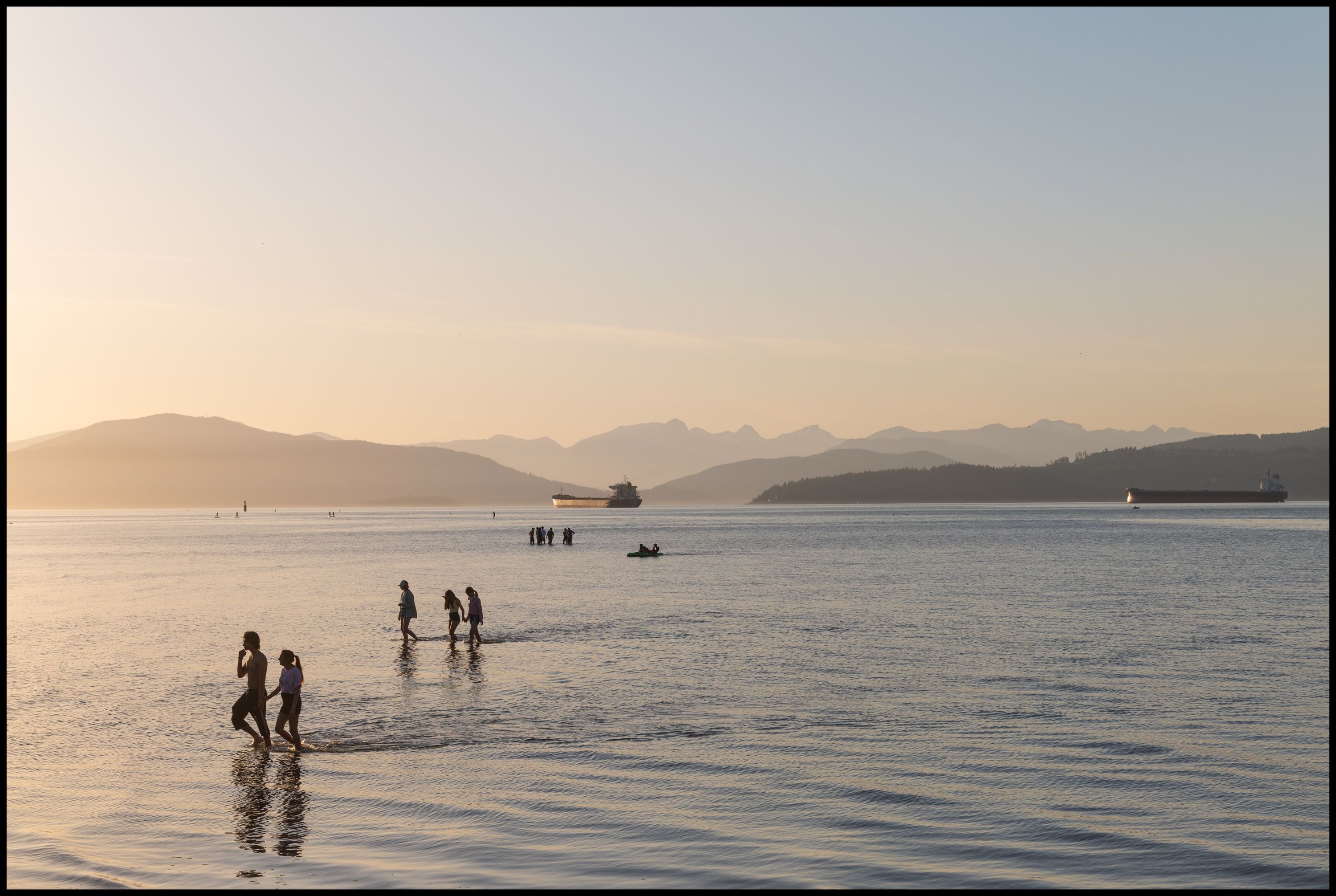
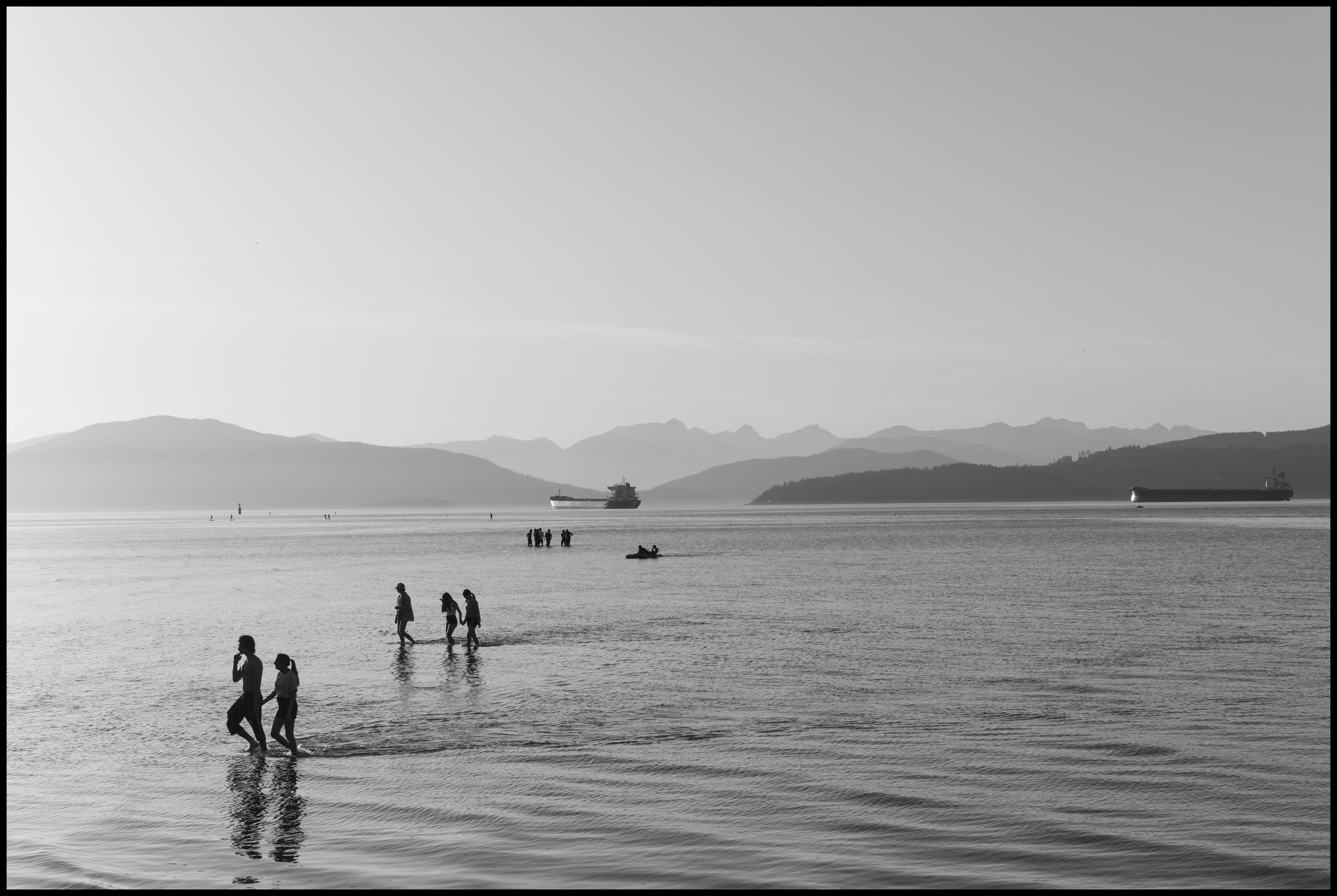
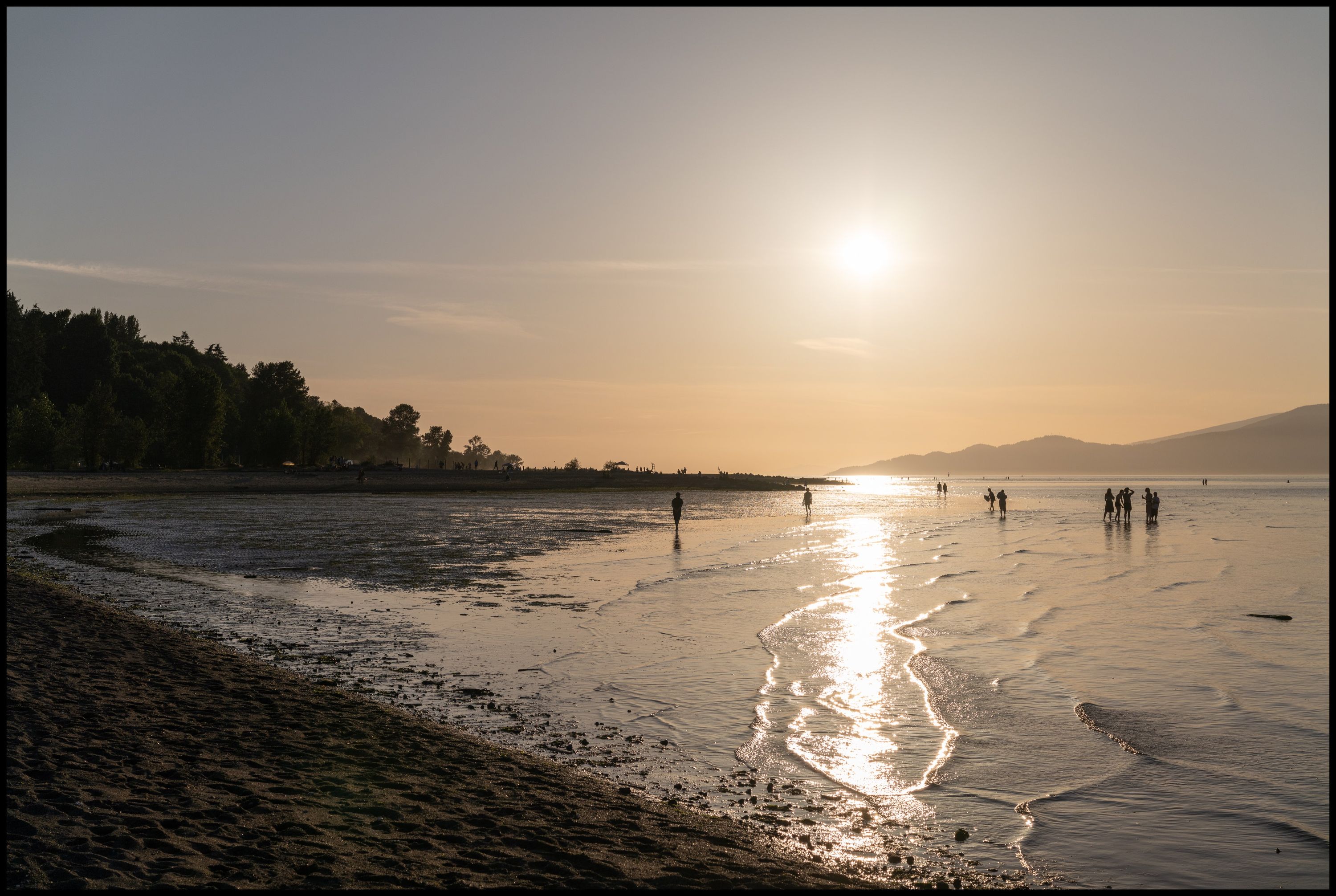
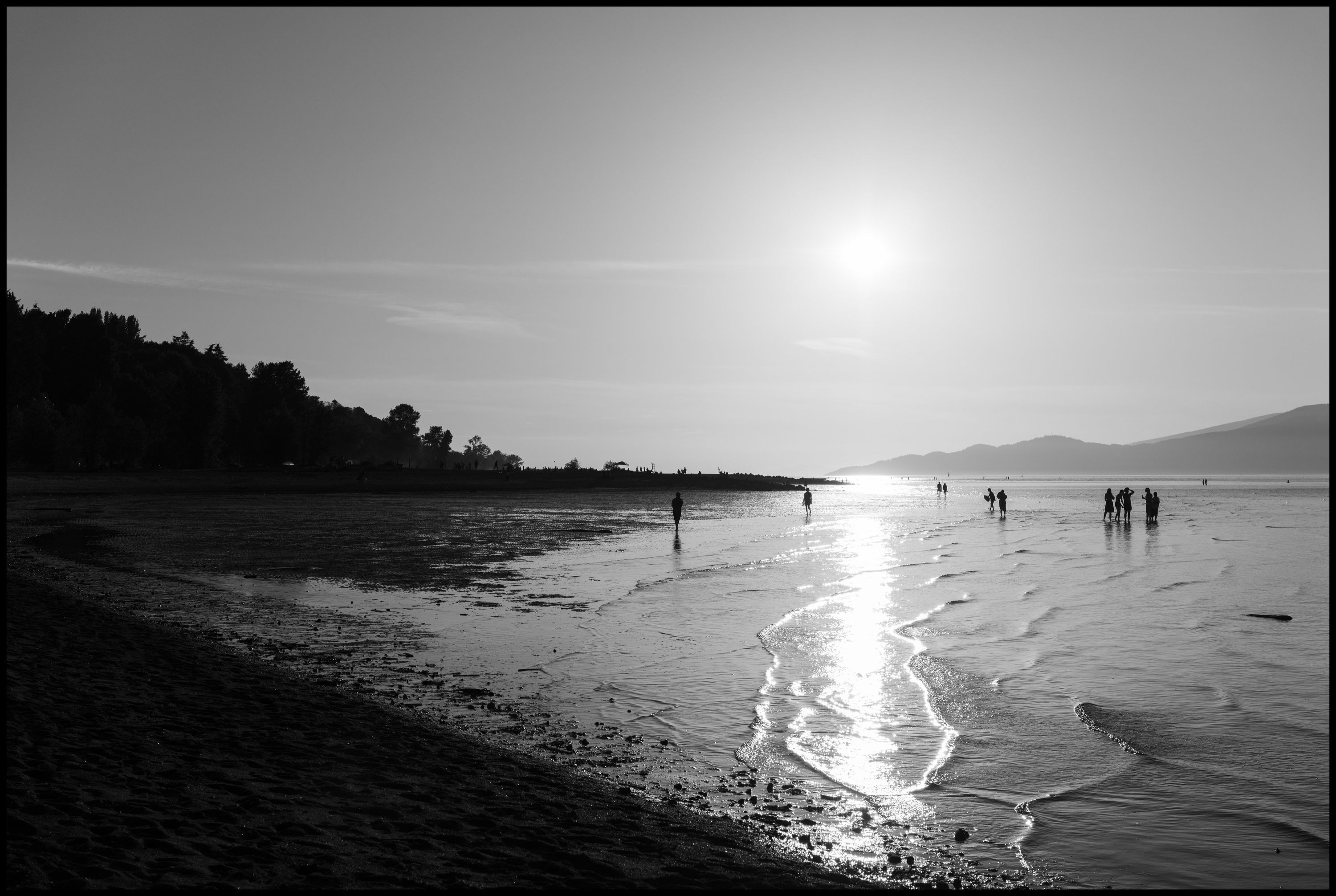
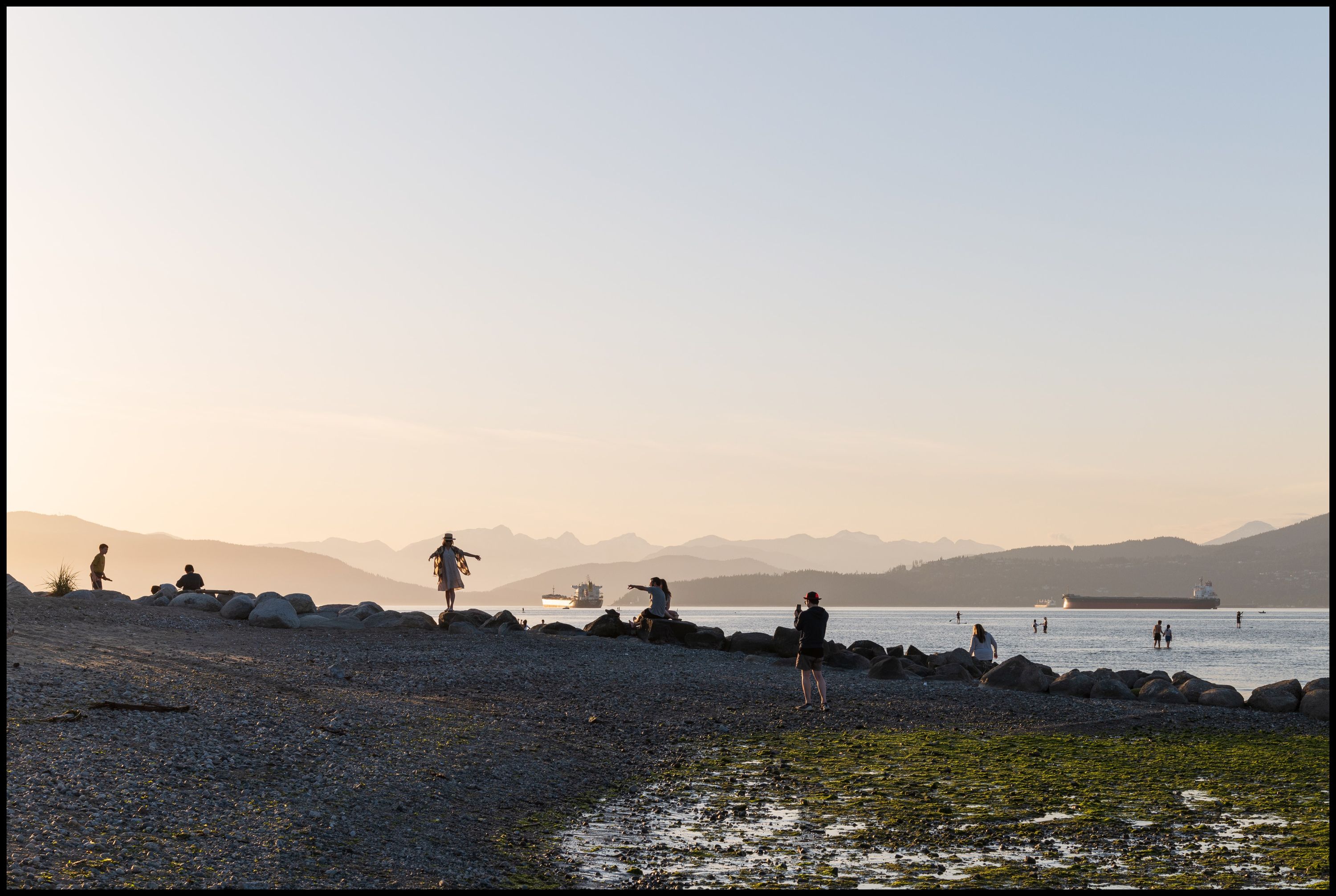
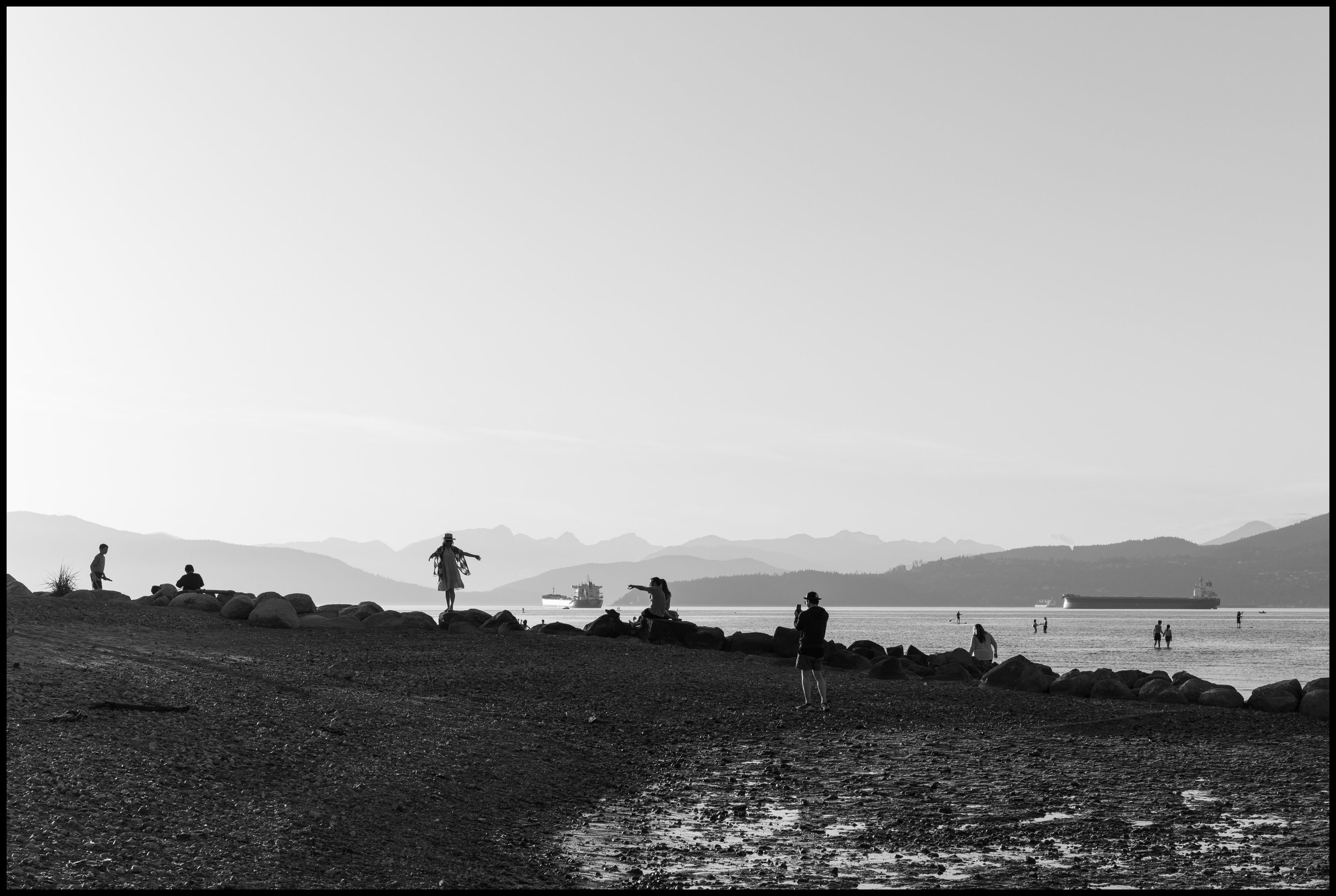
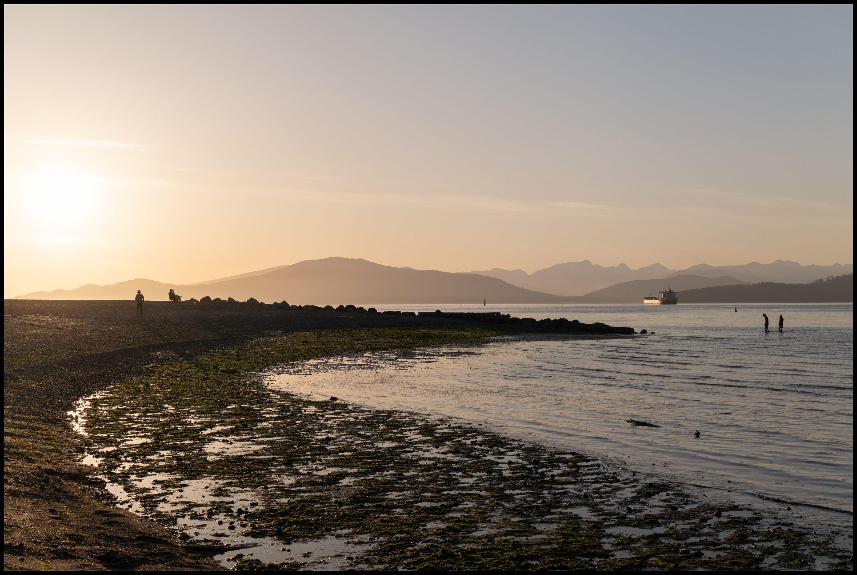
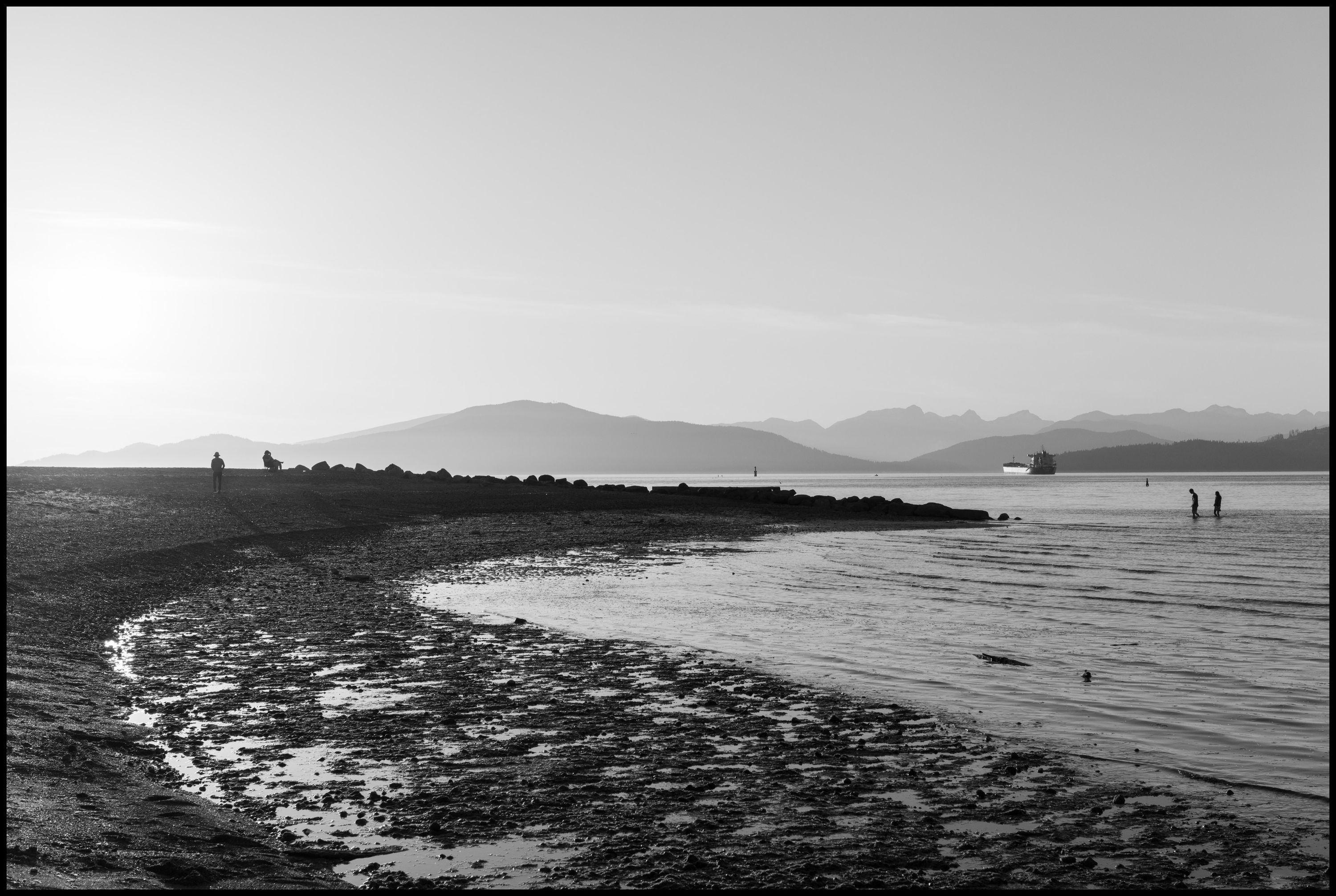
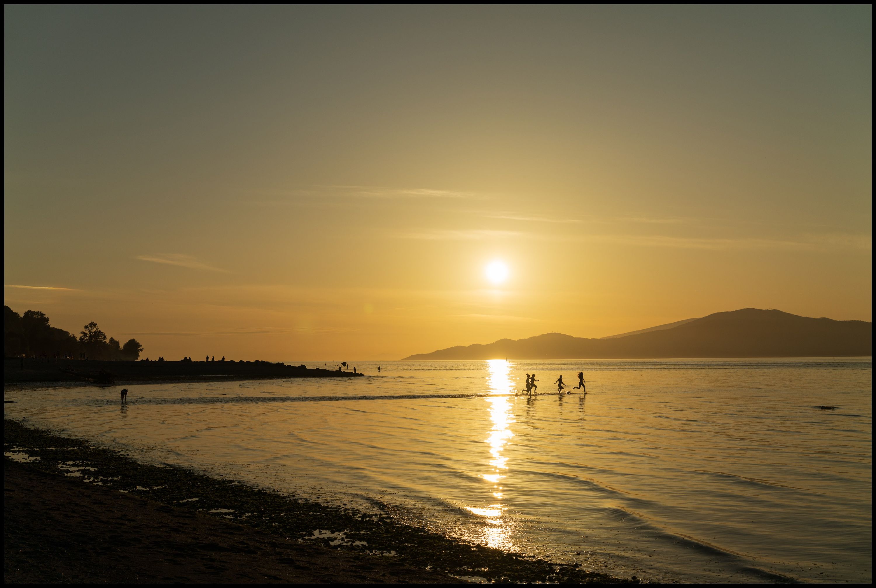
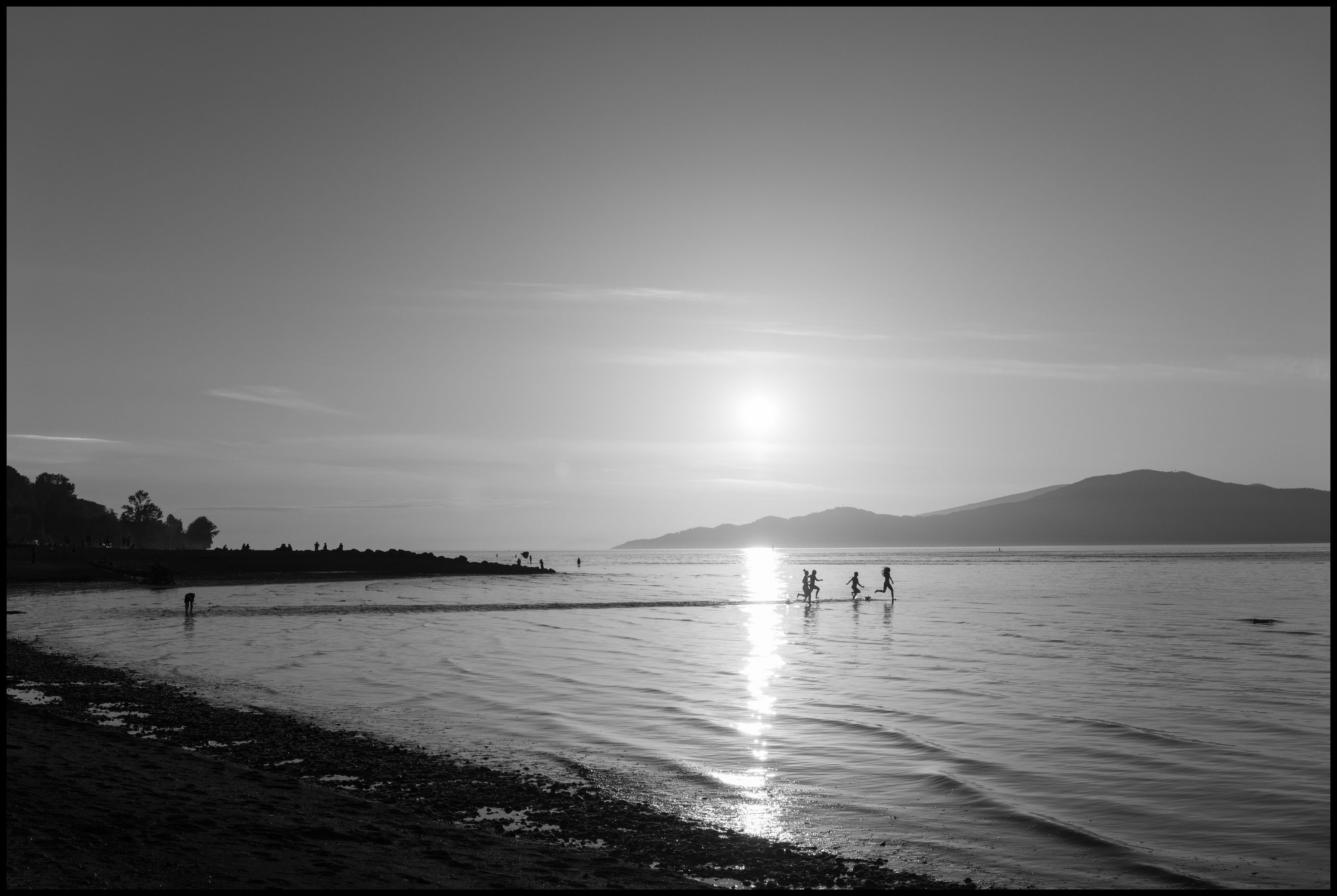
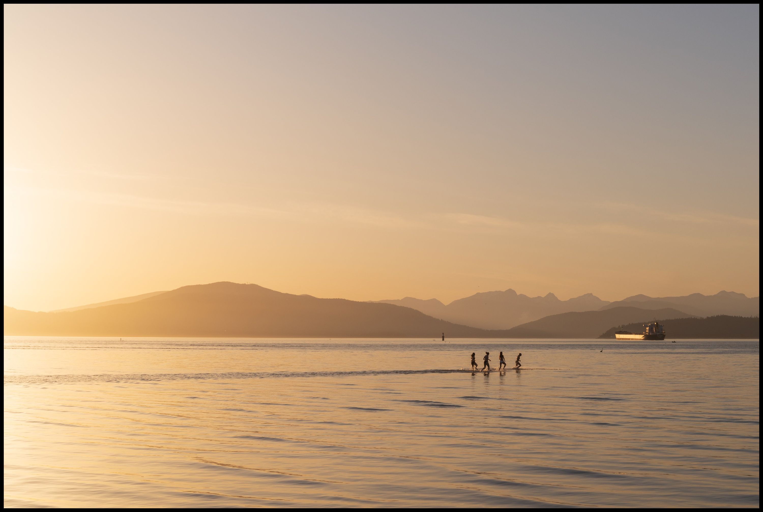
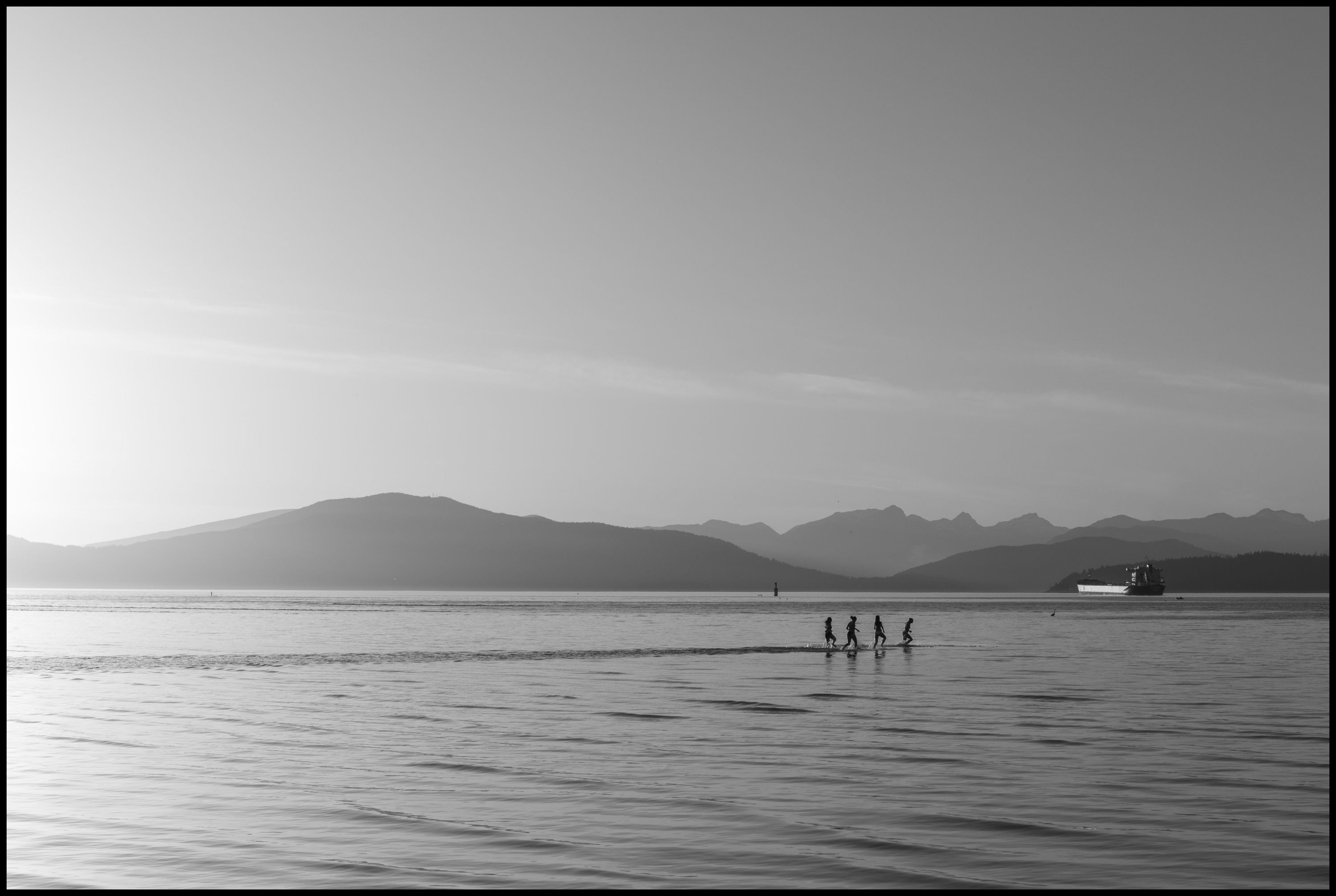
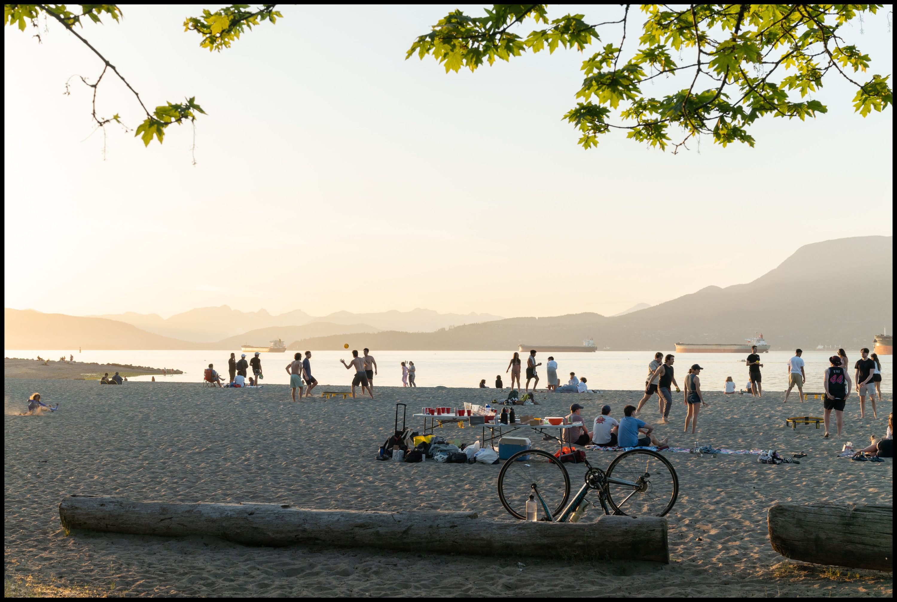
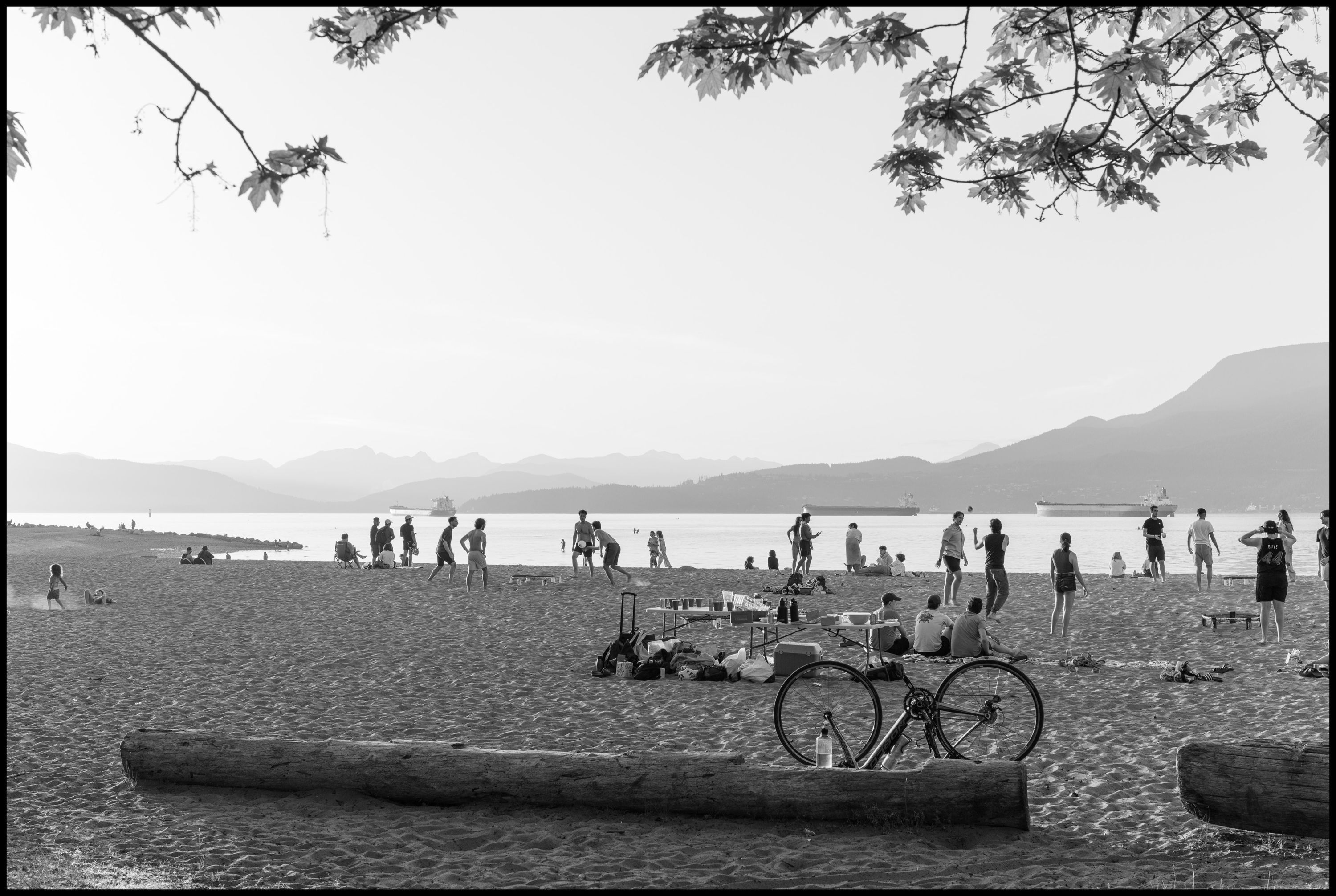
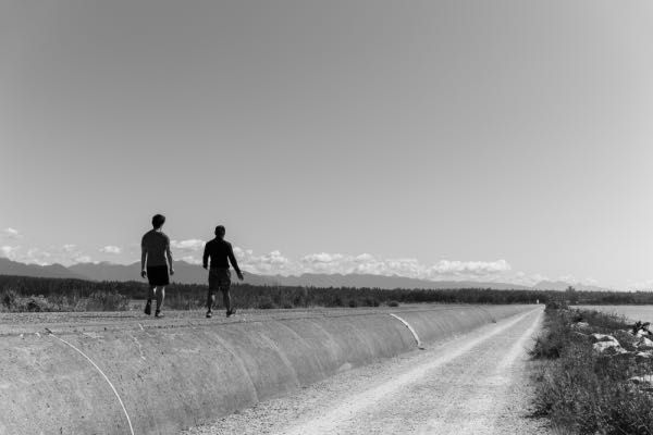
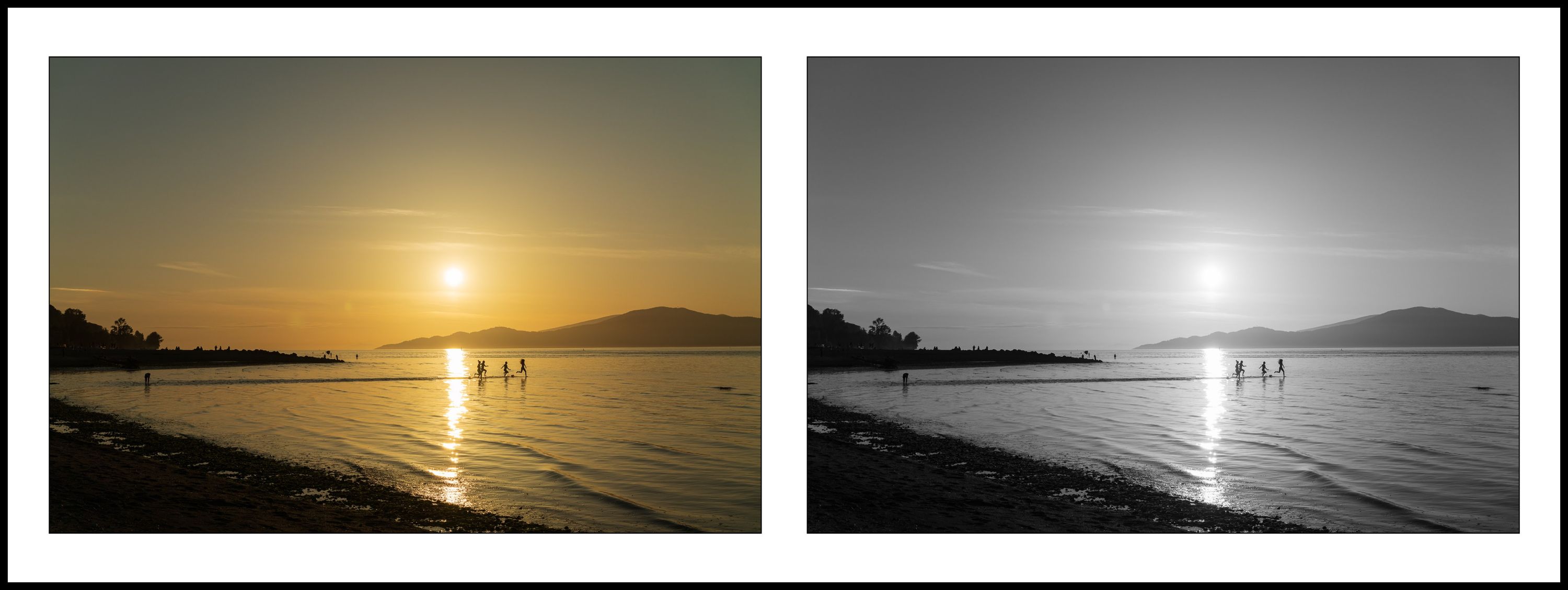
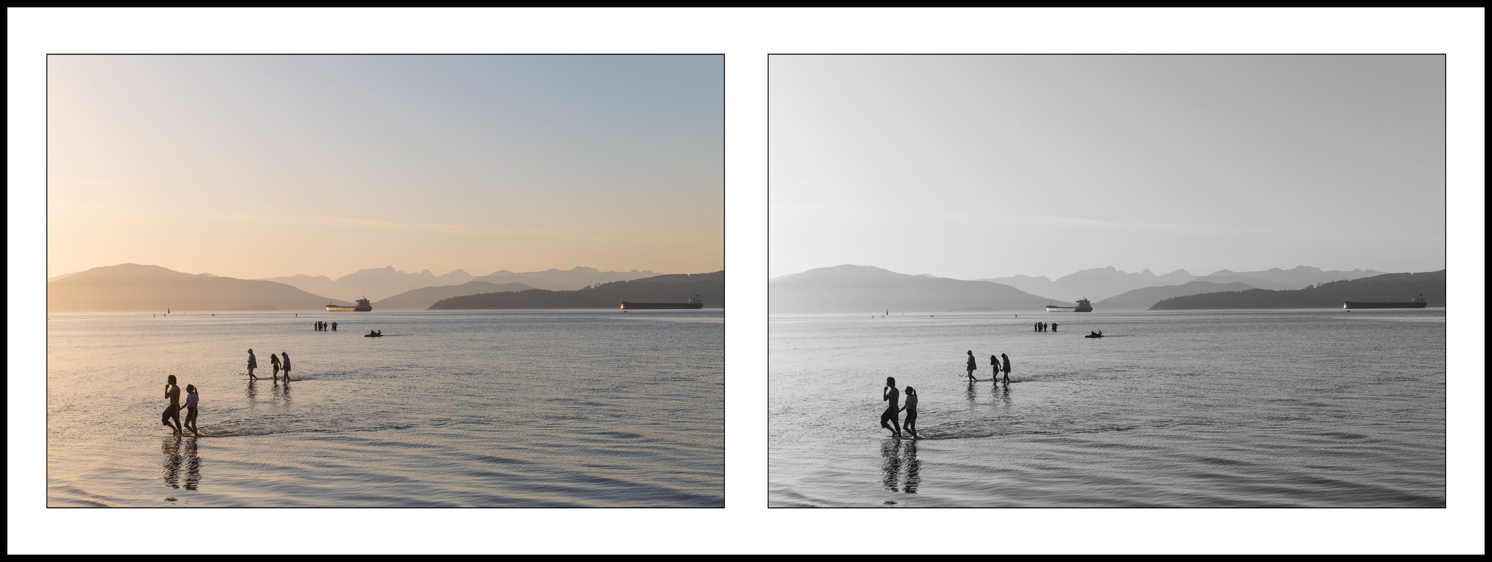
The following photos are from yesterday evening down at Spanish banks. I went out with the camera’s electronic viewfinder set to show only black and white, allowing me to focus on lighting and composition without the “distraction” of color. When I got home and started processing the images my curiosity got the best of me, I needed to see what the images looked like in color as well. Each photo below has a color and black and white version. What do you think? Color, Black & White or both?
You can view more color work on this site here and black & white here. Additionally, my Flickr account is all black and white while Instagram is a mix
Leica SL2 & Sigma 45mm f2.8 DG DN Contemporary lens